Le portail suisse pour les sciences historiques

Swiss Open Cultural Data Hackathons

Ask the Artist

infoclio.ch Vorträge
dimanche, 28. Octobre 2018

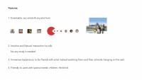
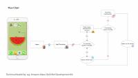
The project idea is to create a voice assistance with the identity of an artist. In our case, we created a demo of the famous Swiss painter Ferdinand Hodler. That is to say, the voice assistance is nor Siri nor Alexa. Instead, it is an avatar of Ferdinand Hodler who can answer your questions about his art and his life.

You can directly interact with the program by talking, as what you would do normally in your daily life. You can ask it all kinds of questions about Ferdinand Hodler, e.g.:

  • When did you start painting?
  • Who taught you painting?
  • Can you show me some of your paintings?
  • Where can I find an exhibition with your artworks?

By talking to the digital image of the artist directly, we aim to bring the art closer to people's daily life, in a direct, intuitive and hopefully interesting way.

As you know, museum audiences need to keep quiet which is not so friendly to children. Also, for people with special needs, like the visually dispaired, and people without professional knowledge about art, it is not easy for them to enjoy the museum visit. To make art accessible to more people, a voice assistance can help with solving those barriers.

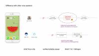
If you asked the difference between our product with Amazon's Alexa or Apple's Siri, there are two major points:

  1. The user can interact with the artist in a direct way: talking to each other. In other applications, the communication happened by Alexa or Siri to deliver the message as the 3rd party channel. In our case, users can have immersive and better user experienceand they will feel like if they were talking to an artist friend, not an application.
  1. The other difference is that the answers to the questions are preset. The essence of how Alexa or Siri works is that they search the question asked by users online and read the returned search results out. In that case, we cannot make sure that the answer is correct and/or suitable. However, in our case, all the answers are coming from reliable data sets of museum and other research institutions, and have been verified and proofread by the art experts. Thus, we can proudly say, the answers from us are reliable and correct. People can use it as a tool to educate children or as visiting assistance in the exhibition.


Data

  • List and link your actual and ideal data sources.
  • Kunsthaus Zürich

⭐️ List of all Exhibitions at Kunsthaus Zürich

  • SIK-ISEA

⭐️ Artist data from the SIKART Lexicon on art in Switzerland

  • Swiss National Museum

⭐️ Representative sample from the Paintings & Sculptures Collection (images and metadata)

  • Wikimedia Switzerland

Team

Artify

infoclio.ch Vorträge
dimanche, 28. Octobre 2018

Explore the collection in a new, interessting way

You have to find objects, which have similar metadata and try to match them. The displayed objects are (semi-)randomly selected from a dataset (eg. from SNM). From the metadata of the starting object, the app will search for three other objects:

  • One which matches in 2+ metadata tags
  • One which matches in 1 metadata tag
  • One which is completly random.

If you choose the right one, the app will display three new objects accordingly to the way explained above.

Tags used from the datasets:

  • OBJEKT Klassifikation (x)
  • OBJEKT Webtext
  • OBJEKT Datierung (x)
  • OBJEKT → Herstellung (x)
  • OBJEKT → Herkunft (x)

(x) = used for matching

To Do
  • Datasets are too divers; in some cases there is no match. Datasets need to be prepared.
  • The tag “Klassifikation” is too specific
  • The tags “Herstellung” and “Herkunft” are often empty or not consistent.

Use case

There are various cases, where the app could be used. It mainly depends on the datasets you use:

  • Explore hidden objects of a museum collection
  • Train students to identify art periods
  • Find connections between museums, which are not obvious (e.g. art and historical objects)

Data

Democase:

SNM
https://opendata.swiss/en/organization/schweizerisches-nationalmuseum-snm

–> Build with two sets: Technologie und Brauchtum / Kutschen & Schlitten & Fahrzeuge

Links

Team

  • Micha Reiser
  • Jacqueline Martinelli
  • Anastasiya Korotkova
  • Dominic Studer
  • Yaw Lam

Letterjongg

infoclio.ch Vorträge
dimanche, 28. Octobre 2018

In 1981 Brodie Lockard, a Stanford University student, developed a computer game just two years after a serious gymnastics accident had almost taken his life and left him paralyzed from the neck down. Unable to use his hands to type on a keyboard, Lockard made a special request during his long recovery in hospital: He asked for a PLATO terminal. PLATO (Programmed Logic for Automatic Teaching Operations) was the first generalized computer-assisted instruction system designed and built by the University of Illinois.

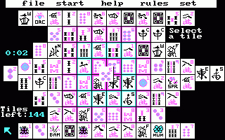
The computer game Lockard started coding on his PLATO terminal was a puzzle game displaying Chinese «Mah-Jongg» tiles, pieces used for the Chinese game that had become increasingly popular in the United States. Lockard accordingly called his game «Mah-Jongg solitaire». In 1986 Activision released the game under the name of «Shanghai» (see screenshot), and when Microsoft decided to add the game to their Windows Entertainment Pack für Win 3.x in 1990 (named «Taipei» for legal reasons) Mah-Jongg Solitaire became one of the world's most popular computer games ever.

Typography

«Letterjongg» aims at translating the ancient far-east Mah-Jongg imagery into late medieval typography. 570 years ago the invention of the modern printing technology by Johannes Gutenberg in Germany (and, two decades later, by William Caxton in England) was massively disruptive. Books, carefully bound manuscripts written and copied by scribes in weeks, if not months, could all of a sudden be mass-produced in a breeze. The invention of moveable types as such, along with other basic book printing technologies, had a huge impact on science and society.

Yet, 15th century typographers were not only businessmen, they were artists as well. Early printing fonts reflect their artistic past. The design of 15th/16th century fonts is still influenced by their calligraphic predecessors. A new book, although produced by means of a new technology, was meant to be what it had been for centuries: a precious document, often decorated with magnificent illustrations. (Incunables – books printed before 1500 – often have a blank space in the upper left corner of a page so that illustrators could manually add artful initials after the printing process.)

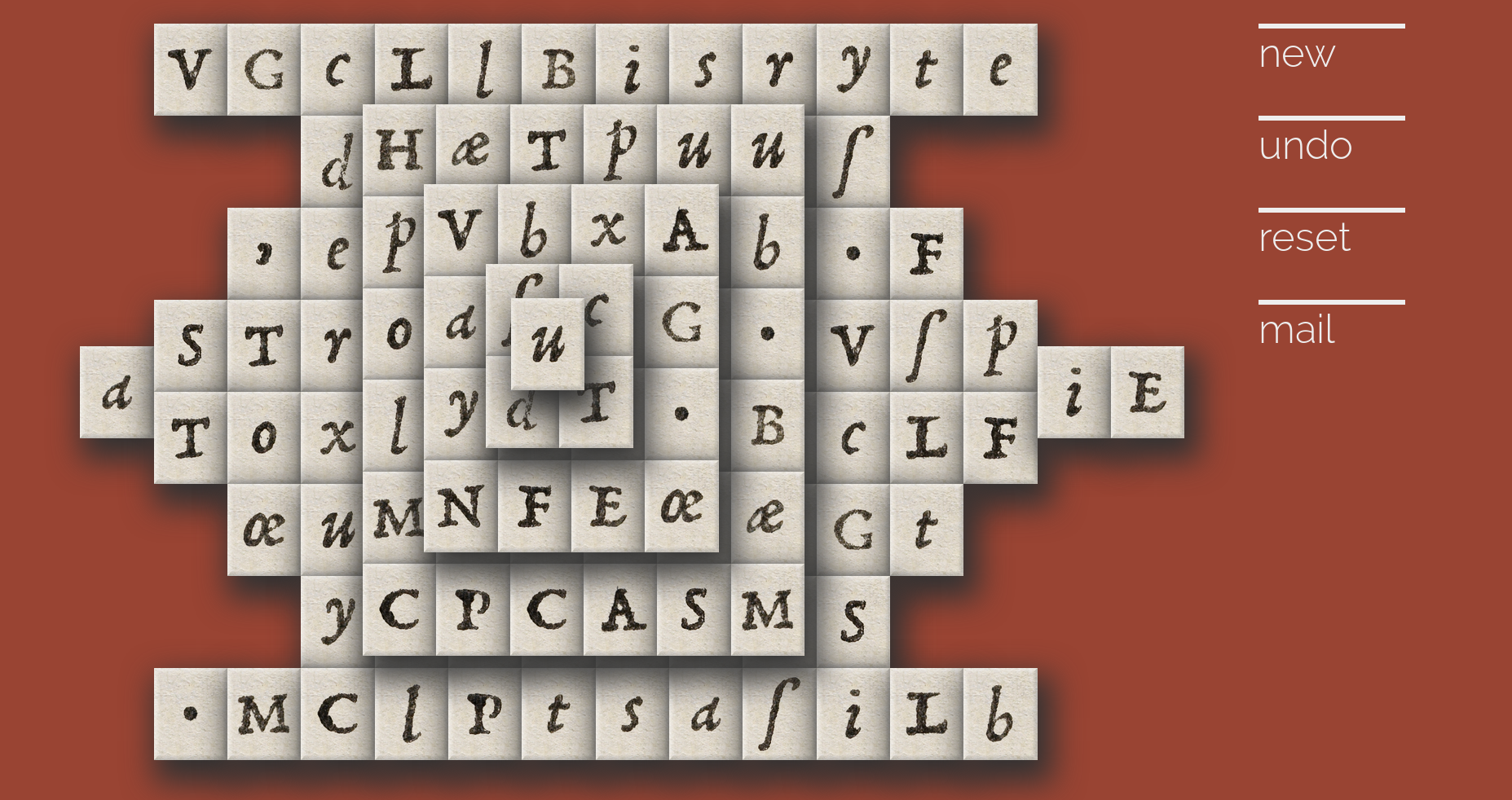
Letterjongg comes with 144 typographic tiles (hence 36 tile faces). The letters have been taken and isolated from a high resolution scan (2,576 × 4,840 pixels, file size: 35.69 MB, MIME type: image/tiff) of Aldus Pius Manutius, Horatius Flaccus, Opera (font design by Francesco Griffo, Venice, 1501). «Letterjongg» has been slightly simplified. Nevertheless it is not easy to play as the games are set up at random (actually not every game can be finished) and the player's visual orientation is constrained by the sheer number and resemblance of the tiles.

Letterjongg, Screenshot

Technical

The game is coded in dynamic HTML (HTML 5, CSS 3, Javascript); no external frameworks or libraries were used.

Rules

Starting from the sides, or from the central tile at the top of the pile, remove tiles by clicking on two equal letters. If the tiles are identical, they will disappear, and your score will rise. Removeable tiles always must be free on their left or right side. If a tile sits between two tiles on the same level, it cannot be selected.

Version History

2018/10/26 v0.1: Basic game engine, prototype

2018/10/27 v0.11: Moves counter, about

2018/10/30 v0.2: Matches counter

2018/11/06 v0.21: Animations

Data

Team

Walking Around the Globe – 3D Picture Exhibition

infoclio.ch Vorträge
dimanche, 28. Octobre 2018

With our Hackathon prototype for a virtual 3D exhibition in VR we tackle several challenges.

• The challenge of exhibition space:
many collections, especially small ones – like the Collection of Astronomical Instruments of ETH Zurich – have only a small or no physical space at all to exhibit their objects to the public

• The challenge of exhibiting light-sensitive artworks:
some artworks – especially art on paper – are very sensitive to the light and are in danger of serious damaged when they are permanently exposed. That’s why the Graphische Sammlung ETH Zurich can’t present their treasures in a permanent exhibition to the public

• The challenge of involving the public:
nowadays the visitors do not want to be reduced to be passive consumers, they want and appreciate active involvement

• The challenge of the scale:
in usual 2D digital presentations the user does not get information about the real scale of the artworks and gets wrong ideas about the dimensions

• The challenge of showing 3D objects in the digital space:
many museum databases show only one or two digital images of their 3D objects, so the user gets only a very limited impression

Our Hackathon prototype for a virtual 3D exhibition in VR

• offers unlimited exhibition space in the virtual reality

• makes it possible to exhibit light sensitive artworks permanently using their digital reproductions

• involves the public inviting them to slip into the role of the curator

• shows the artwork in the correct scale

• and gives the users the opportunity to walk around the 3D objects in the virtual space

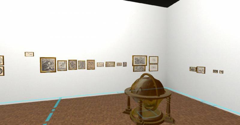
A representative screenshot:

We unveil a window into a future where you can create, curate and experience virtual 3D expositions in VR.
We showcase a first exposition with a 3D-Model of a globe like in the Collection of Astronomical Instruments of ETH Zurich as a centerpiece and works of art from the Graphische Sammlung ETH Zurich surrounding it. Users can experience our curated exposition using a state-of-the-Art VR headset, the HTC Vive.

Our vision has massive value for practitioners, educators and students and also opens up the experience of curation to a broader audience. It enables art to truly transcend borders, cultures and economic boundaries.

Project Presentation

You can download the presentation slides: 20181028_glamhack_presentation.pdf.

Project Impressions

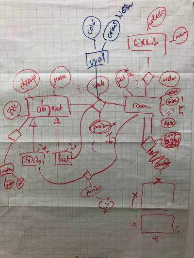
On the very first day, we create our data model on paper by ensuring everybody got a chance to present their use cases, stories and needs.

On Friday evening, we had a first prototype of our VR Environment:

On Saturday, we created our interim presentation, improved our prototype, curated our exposition, and tried and ditched many ideas.

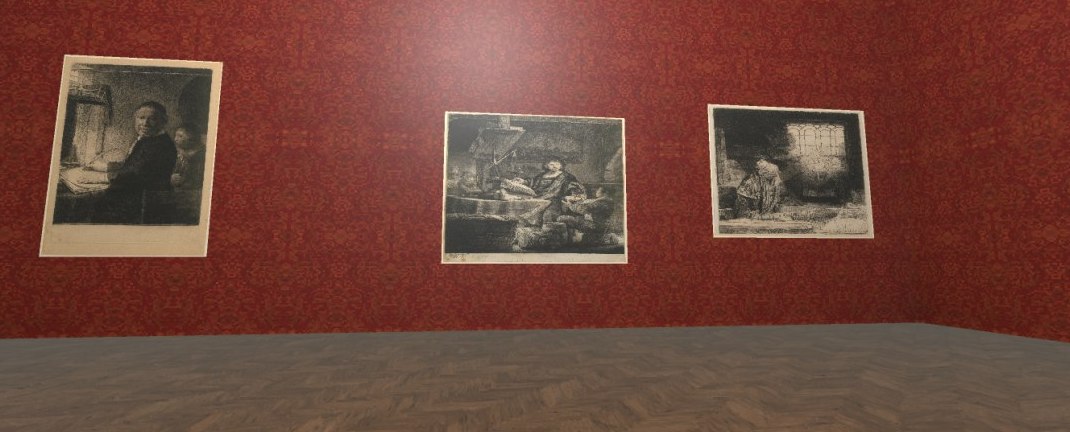
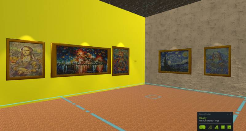
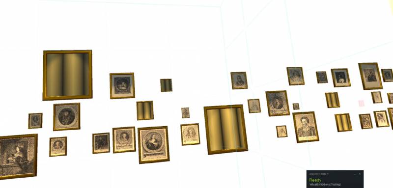
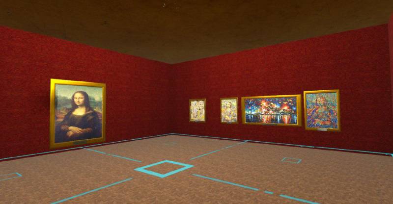
Saturday evening saw our prototype almost finished! Below a screenshot of two rooms, one curated by experts and the other one containing artificially generated art.

Our final project status involves a polished prototype with an example exhibition consisting of two rooms:

Walking Around The Globe: A room
curated by art experts, exhibiting a selection of old
masterpieces (15th
century to today).

Style transfer: A room designed by laymen
showing famous paintings & derivates generated by
an artificial intelligence (AI) via a technique called
style transfer.

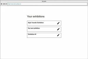
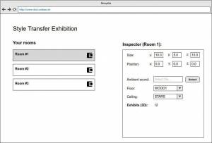
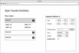
In the end we even created a mockup of the possible backend ui, the following images are some impressions for it:


Technical Information

Our code is on Github, both the Frontend and the Backend.

We are using Unity with the SteamVR Plugin to deploy on the HTC Vive. This combination means we had to use combinations of C# Scripting (We recommend the excellent  Rider Editor), design using the Unity Editor, custom modifications to the SteamVR plugin, do 3d model imports using FastObjImporter and other fun stuff.

Our backend is written in Java and uses MongoDB.

For the style transfer images, we used a open source python code which is available on Github.

Acknowledgments

The Databases and Information Systems Group at the University of Basel is the home of a majority of our project members. Our hardware was borrowed for the weekend from the Gravis Group from Prof. Vetter.

Data

  • Dataset with digital images (jpg) and metadata (xml) from the Collection of Astronomical Instruments of ETH Zurich
  • Graphische Sammlung ETH Zurich, Collection Online, four sample datasets with focus on bodies in the air, portraits, an artist (Rembrandt) and different techniques (printmaking and drawing)

Team

We-Art-o-nauts

infoclio.ch Vorträge
dimanche, 28. Octobre 2018

A better way to experience art:
Build a working, easy to follow example that integrates open and curated culture data with VR devices in a museum exhibition to provide modern, fun and richer visitor experience. Focusing on one art piece, organizing data alone the timeline, building a concept and process, so anyone who want to use above technologies can easily follow the steps for any art object for any museum.

Have a VR device next to the painting, we integrate interesting facts about the painting in a 360 timeline view with voice over. Visitors can simply put it on to use it.

Try the live demo in your browser - works particularly well on mobile phones, and supports Google Cardboard:

DEMO

Visit the project homepage for more information, and to learn more about the technology and data used.

See also: hackathon presentation (PPTX) | source code (GitHub)

Data

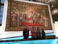
  1. “Allianzteppich”, a permanent collection in Landsmuseum
  2. Curated data from Dominik Sievi in Landsmuseum
  3. Open data sources (WikiData)

Team

  • Kamontat Chantrachirathumrong (Developer)
  • Oleg Lavrovsky (Developer)
  • Marina Pardini (UX designer)
  • Birk Weiberg (Art Historian)
  • Xia Willuhn (Developer)

Swiss Art Stories on Twitter

infoclio.ch Vorträge
dimanche, 28. Octobre 2018

In the project “Swiss art stories on Twitter”, the Twitter bot “larthippie” has been created. The idea of the project is to automatically tweet information on Swiss art, artists and exhibitions.

Originally, different storylines for the tweets were discussed and programmed, such as:

- Tweeting information about upcoming exhibitions at Kunsthaus Zürich and reminders with approaching deadlines

- Tweets with specific information about artists, taken from the artists database SIK-ISEA

- Tweeting the exhibition history of Kunsthaus Zürich

- Comparing the images of artworks, created in the same year, held at the same location or showing the same subject

The prototype however has another focus now. It tweets the ownership history (provenance) of artworks. As the the information is scientifically researched, larthipppie provides tweets for art professionals. Therefore the twitter bot is more than a usual social media account, but might become a tool for provenance research. Interested audience has to follow larthippie in order to be updated on new provenance information. As an additional feature, the twitterbot larthippie likes and follows accounts that shares content from Swiss artists.

Followers can message the bot and ask for information about a painting on any artist. In the prototype, it is only possible to query the provenance of artworks by Ferdinand Hodler. In the future, the twitter bot might also tweet newly acquired works in art museums.

You can check the account by the following link:
https://twitter.com/larthippie

Data

  • Swiss Institute for Art Research (SIK-ISEA)
  • Kunsthaus Zürich
  • Swiss National Museum

Team

Dog Name Creativity Survey

infoclio.ch Vorträge
dimanche, 28. Octobre 2018

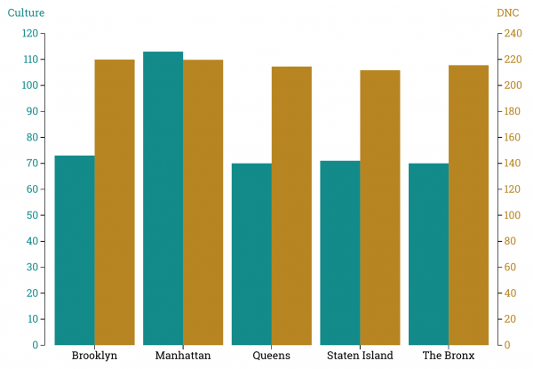
How does the creativity of given dog names related to the amount of culture found in the different boroughs of New York City?

We started this project to see if art and cultural institutions in the environment have an impact on the creativity of dognames. This was not possible with the date from Zurich because the name-dataset does not contain information about the location and the dataset about the owners does not include the dognames. We choose to stick with our idea but used a different dataset: NYC Dog Licensing Dataset.

The creativity of a name is measured by the frequency of each letter in the English language and gets +/- points according to the amount of dogs with the same name. The data for the cultural environment comes from Wikidata.

After some data-cleaning with OpenRefine and failed attempts with OpenCalc we got the following code:

import string
import pandas as pd

numbers_ = {"e":1,"t":2,"a":3,"o":4,"n":5,"i":6,"s":7,"h":8,"r":9,"l":10,"d":11,"u":12,"c":13,"m":14,"w":15,"y":16,"f":17,"g":18,"p":19,"b":20,"v":21,"k":22,"j":23,"x":24,"q":25,"z":26}
name_list = []

def KreaWert(name_):
    name_ = str(name_)
    wert_ = 0
    for letter in str.lower(name_):
        temp_ = 0
        if letter in string.ascii_lowercase :
            temp_ += numbers_[letter]
            wert_ += temp_
    if name_ in H_:   
        wert_ = wert_* ((Hmax-H_[name_])/(Hmax-1)*5 + 0.2)
    return round(wert_,1)

df = pd.read_csv("Vds3.csv", sep = ";")
df["AnimalName"] = df["AnimalName"].str.strip()
H_ = df["AnimalName"].value_counts()
Hmax = max(H_)
Hmin = min(H_)

df["KreaWert"] = df["AnimalName"].map(KreaWert)
df.to_csv("namen2.csv")

dftemp = df[["AnimalName", "KreaWert"]].drop_duplicates().set_index("AnimalName")
dftemp.to_csv("dftemp.csv")

df3 = pd.DataFrame()
df3["amount"] = H_
df3 = df3.join(dftemp, how="outer")
df3.to_csv("data3.csv")

df1 = round(df.groupby("Borough").mean(),2)
df1.to_csv("data1.csv")

df2 = round(df.groupby(["Borough","AnimalGender"]).mean(),2)
df2.to_csv("data2.csv")

Visualisations were made with D3: https://d3js.org/

Data

Team

  • Birk Weiberg
  • Dominik Sievi

VR Visits Zurich

infoclio.ch Vorträge
dimanche, 28. Octobre 2018

Find Me an Exhibit

infoclio.ch Vorträge
dimanche, 28. Octobre 2018

Are you ready to take up the challenge? Film categories of objects in the exhibition “History of Switzerland” running against the clock.

The app displays one of several categories of exhibits that can be found in the exhibition (like “cloths”, “paintings” or “clocks”). Your job is to find a matching exhibit as quick as possible. You don't have much time, so hurry up!

Best played on portable devices. ;-)

The frontend of the app is based on the game “Emoji Scavenger Hunt”, the model is built with TensorFlow.js fed with a lot of images kindly provided by the National Museum Zurich. The app is in pre-alpha stage.

Data

Team

  • Some data ramblers

View Find (Library Catalog Search)

infoclio.ch Vorträge
dimanche, 28. Octobre 2018

Team

  • Stefanie Kohler
  • Stephan Gantenbein

Back to the Greek Universe

infoclio.ch Vorträge
dimanche, 8. Septembre 2019

Simulation of the Ptolemaic system of the universe

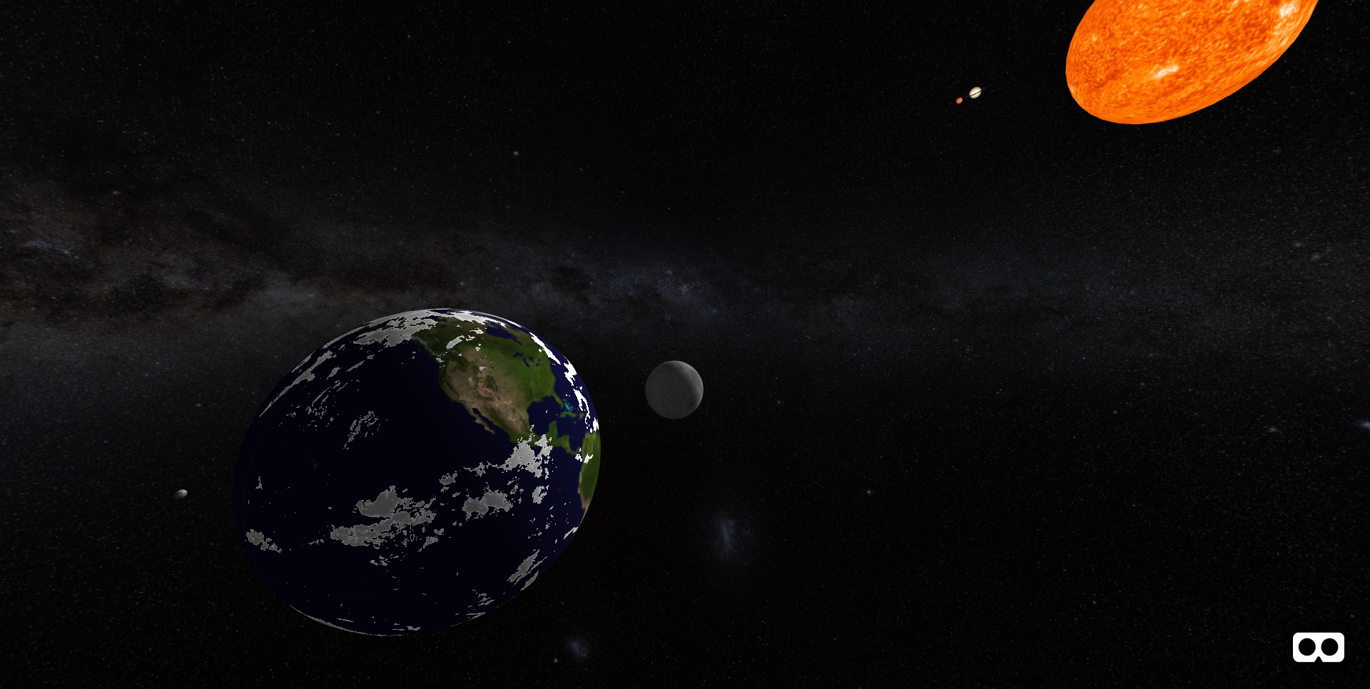
Back to the Greek Universe is a web application that allows users to explore the ancient Greek model of the universe in virtual reality so that they can realize what detailed knowledge the Greeks had of the movement of the celestial bodies observable from the Earth's surface. The model is based on Claudius Ptolemy's work, which is characterized by the fact that it adopts a geo-centric view of the universe with the earth in the center.

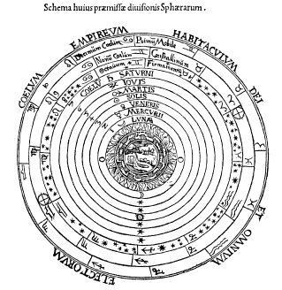
Ptolemy placed the planets in the following order:

  1. Moon
  2. Mercury
  3. Venus
  4. Sun
  5. Mars
  6. Jupiter
  7. Saturn
  8. Fixed stars

Renaissance woodcut illustrating the Ptolemaic sphere modelThe movements of the celestial bodies as they appear to earthlings are expressed as a series of superposed circular movements (see deferent and epicycle theory), characterized by varying radius and speed. The tabular values that serve as inputs to the model have been extracted from literature.

Demo Video

Claudius Ptolemy (~100-160 AD) was a Greek scientist working at the library of Alexandria. One of his most important works, the «Almagest», sums up the geographic, mathematical and astronomical knowledge of the time. It is the first outline of a coherent system of the universe in the history of mankind.

Back to the Greek Universe is a VR model that rebuilds Ptolemy’s system of the universe on a scale of 1/1 billion. The planets are 100 times larger, the earth rotates 100 times more slowly. The planet orbits periods are 1 million times faster than they would be according to Ptolemy’s calculations.

Back to the Greek Universe was coded and presented at the Swiss Open Cultural Data Hackathon/mix'n'hack 2019 in Sion, Switzerland, from Sept 6-8, 2019, by Thomas Weibel, Cédric Sievi, Pia Viviani and Beat Estermann.

Instructions

This is how to fly Ptolemy's virtual spaceship:
  • Point your smartphone camera towards the QR code, tap on the popup banner in order to launch into space.
  • Turn around and discover the ancient greek solar system. Follow the planets' epicyclic movements (see above).
  • Tap in order to travel through space, in any direction you like. Every single tap will teleport you roughly 18 million miles forward.
  • Back home: Point your device vertically down and tap in order to teleport back to earth.
  • Gods' view: Point your device vertically up and tap in order to overlook Ptolemy’s system of the universe from high above.

The cockpit on top is a time and distances display: The years and months indicator gives you an idea of how rapidly time goes by in the simulation, the miles indicator will always display your current distance from the earth center (in million nautical miles).

Data

The data used include 16th century prints of Ptolemy's main work, the Almagest (both in greek and latin) and high-resolution surface photos of the planets in Mercator projection. The photos are mapped onto rotating spheres by means of Mozilla's web VR framework A-Frame.

Earth
Earth map (public domain)

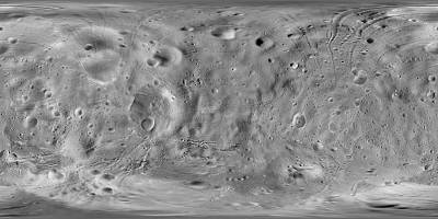
Moon
Moon map (public domain)

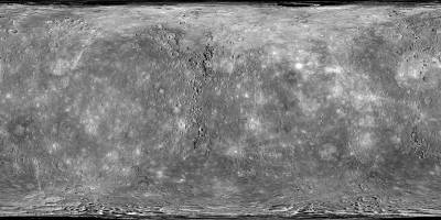
Mercury
Mercury map (public domain)

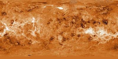
Venus
Venus map (public domain)

Sun
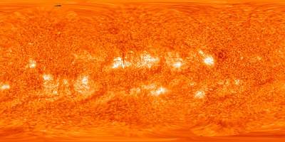
Sun map (public domain)

Mars
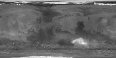
Mars map (public domain)

Jupiter
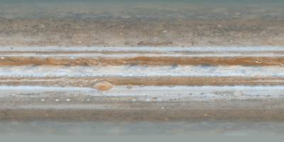
Jupiter map (public domain)

Saturn
Saturn map (public domain)


Stars map (milky way) (Creative Commons Attribution 4.0 International)

Primary literature

Secondary literature

Version history

2019/09/07 v1.0: Basic VR engine, interactive prototype

2019/09/08 v1.01: Cockpit with time and distance indicator

2019/09/13 v1.02: Space flight limited to stars sphere, minor bugfixes

2019/09/17 v1.03: Planet ecliptics adjusted

Team

CoViMAS

infoclio.ch Vorträge
dimanche, 8. Septembre 2019
Day One

CoViMAS joins forces of different disciplines to form a group which contains Maker, content provider, developer(s), communicator, designer and user experience expert. Having different backgrounds and expertise made a great opportunity to explore different ideas and opportunities to develop the horizons of the project.

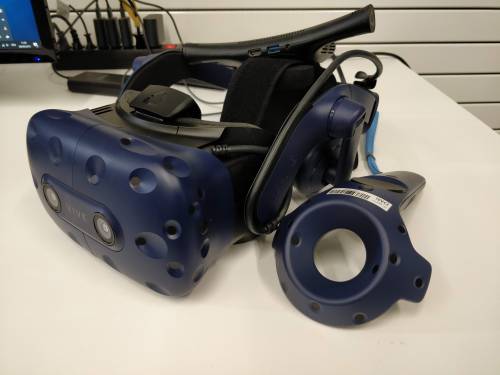
Two vital components of this project is Virtual Reality headset and Datasets which are going to be used. HTC Vive Pro VR headsets are converted to wireless mode after our last experiment which prove the freedom of movement without wires attached to the user, increases the user experience and feasibility of usage.

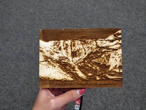
Our team content provider and designer spent invaluable amount of time to search for the representative postcards and audio which can be integrated in the virtual space and have the potential to improve the virtual reality experience by adding extra senses. This includes selecting postcards which can be touched and seen in virtual and non-virtual reality. Additionally, to improve the experience, and idea of hearing a sound which is related to the picture being viewed popped up. This audio should have a correlation with the picture being viewed and recreate the sensation of the picture environment for the user in virtual world.

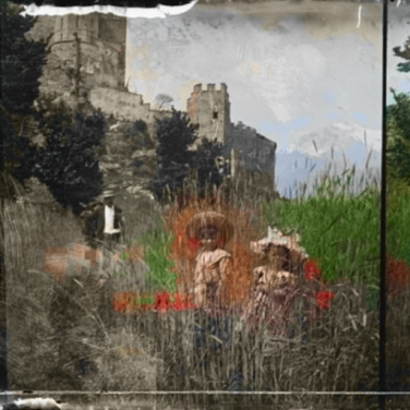
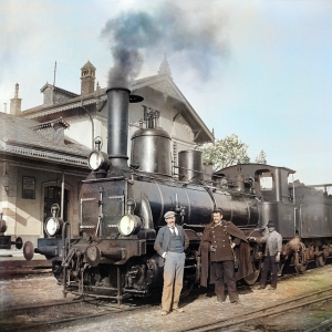
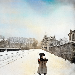
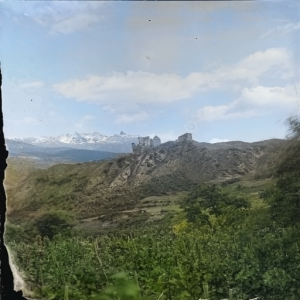
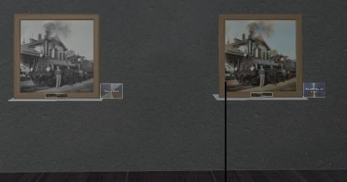
To integrate the modern methods of Image manipulation through artificial Intelligence, we tried using Deep Learning method to colorize the gray-scale images of the “otografien aus dem Wallis von Charles Rieder”. The colored images allow the visitor get a more sensible feeling of the pictures he/she is viewing. The initial implementation of the algorithm showed the challenges we face, for example the faded parts of the pictures or scratched images could not very well be colorized.

img_20190908_112033_1_.jpg

Day Two

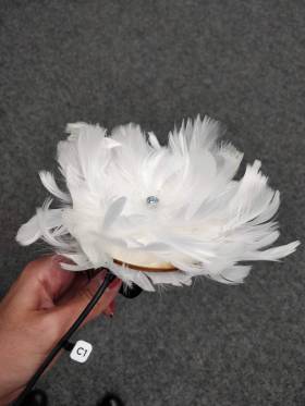
Although the VR exhibition is taken from our previous participation in Glamhack2018, the exhibition needed to be adjusted to the new content. We have designed the rooms to showcase the dataset “Postkarten aus dem Wallis (1890-1950)”. at this point, the selected postcards to be enriched with additional senses are sent to the Fablab, to create a haptic card and a feather pallet which is needed to be used alongside one postcard which represent a goose.

the fabricated elements of our exhibition get attached to a tracker which can be seen through VR glasses and this allows the user to be aware of location of the object, and sense it.

The Colorization improved through the day, by some alteration in training setup and the parameters used to tune the images. The results at this stage are relatively good.

And the VR exhibition hall is adjusted to be automatically load images from postcards and also the colorized images alongside their original color.

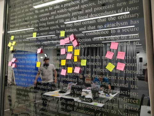
And late night, when finalizing the works for the next day, most of our stickers have changed status from “Implementation” phase to “Done” Phase!

Day Three

CoViMAS is getting to the final stage in the last day. The Room design is finished and the location of the images on the wall are determined. The tracker location is updated in the VR environment to represent the real location of the object. With this improvement the postcard can be touched while being viewed simultaneously.

Data

Team

Opera Forever

infoclio.ch Vorträge
dimanche, 8. Septembre 2019

TimeGazer

infoclio.ch Vorträge
dimanche, 8. Septembre 2019

Welcome to TimeGazer: A time-traveling photo booth enabling you to send greetings from historical postcards.

Based on the wonderful “Postcards from Valais (1890 - 1950)” dataset, consisting of nearly 4000 historic postcards of Valais, we create a prototype for Mixed-Reality photo booth.

Choose a historic postcard as a background and a person will be style-transferred virtually onto the postcard.

Photobomb a historical postcard

A photo booth for time traveling

send greetings from the poster

virtually enter the historical postcard


Mockup of the process.

Based on the wonderful “Postcards from Valais (1890 - 1950)” dataset,
consisting of nearly 4000 historic postcards of Valais, we create a prototype for Mixed-Reality photo booth.
One can choose a historic postcard as a background and a person will be style-transferred virtually onto the postcard.

Potentially with VR-trackerified things to add choosable objects virtually into the scene.

Technology

This project is roughly based on a project from last year, which resulted in an active research project at Databases and Information Systems group of the University of Basel: VIRTUE.
Hence, we use a similar setup:

Results

Project

Blue Screen

Printer box

Standard box on MakerCase:

Modified for the input of paper and output of postcard:

The SVG and DXF box project files.

Data

Quote from the data introduction page:

A collection of 3900 postcards from Valais. Some highlights are churches, cable cars, landscapes and traditional costumes.

Source: Musées cantonaux du Valais – Musée d’histoire

Team

  • Dr. Ivan Giangreco
  • Dr. Johann Roduit
  • Lionel Walter
  • Loris Sauter
  • Luca Palli
  • Ralph Gasser